Reducing Cart Abandonment
for Peppa Pig World.
How persona-driven checkout experiences turned drop-offs into completed bookings.
Funnel analysis mapping where visitors dropped off between basket and payment
Visitors were abandoning at the basket — not the park
Peppa Pig World — one of the UK's most popular family attractions — was losing a significant number of visitors during the ticket purchase journey. Users were adding tickets to their basket but abandoning before completing the order.
While working with a digital agency, I was part of the team brought in to investigate why the drop-off was happening and to redesign the checkout experience to recover lost conversions.
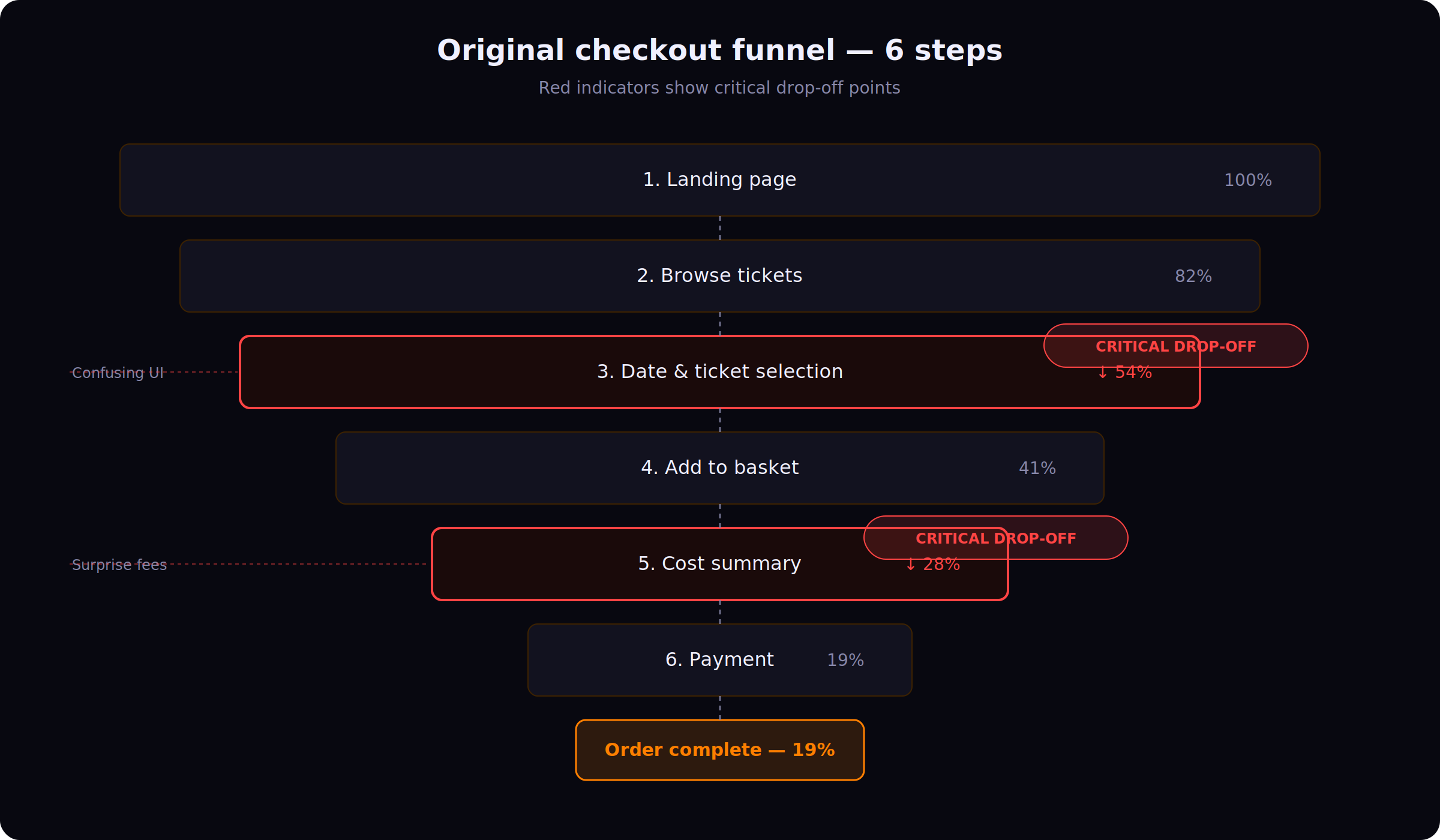
Key metrics from discovery
Finding where — and why — users left
Funnel Analysis
We mapped the full ticket purchase funnel from landing page to order confirmation, identifying exactly where users were dropping off. The biggest losses occurred at two points: the date and ticket selection step, and the final cost summary before payment.
Full funnel mapped from landing to confirmation — drop-off concentrated at date selection and final cost summary
Analytics & Heatmaps
Google Analytics and heatmap data revealed that users were scrolling erratically on the ticket selection page, suggesting confusion. Click maps showed repeated tapping on non-interactive elements — a clear signal of unclear UI affordances.
Stakeholder Workshops
We ran workshops with the client's marketing, customer service, and operations teams. Customer service flagged that they regularly received calls from users who had started booking online but gave up and called to complete the purchase instead — a strong signal of UX friction.
Four root causes identified
Two very different visitors, one broken flow
The data revealed a critical split in user behaviour. First-time visitors and returning visitors were abandoning for fundamentally different reasons.
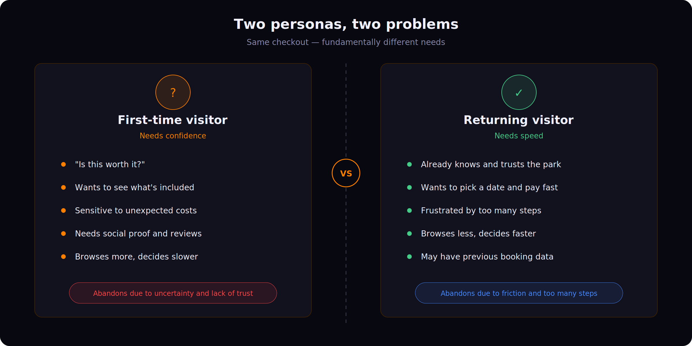
First-time and returning visitors — different motivations, different blockers, one checkout trying to serve both
A single checkout experience was failing both groups. First-timers needed more context and confidence. Returning visitors needed less friction and fewer screens. One journey couldn't serve both.
Persona-based pre-checkout landing pages
Rather than redesigning the entire checkout into one compromised flow, we proposed two distinct pre-checkout landing pages — one for each persona — shown just before users entered the basket journey.
The system would determine which page to show based on whether the user had previously completed a booking (cookie/account data) or was visiting for the first time.
Landing Page A — First-Time Visitors: "Confidence Builder"
Goal: Reduce hesitation. Build trust. Show value before asking for money.
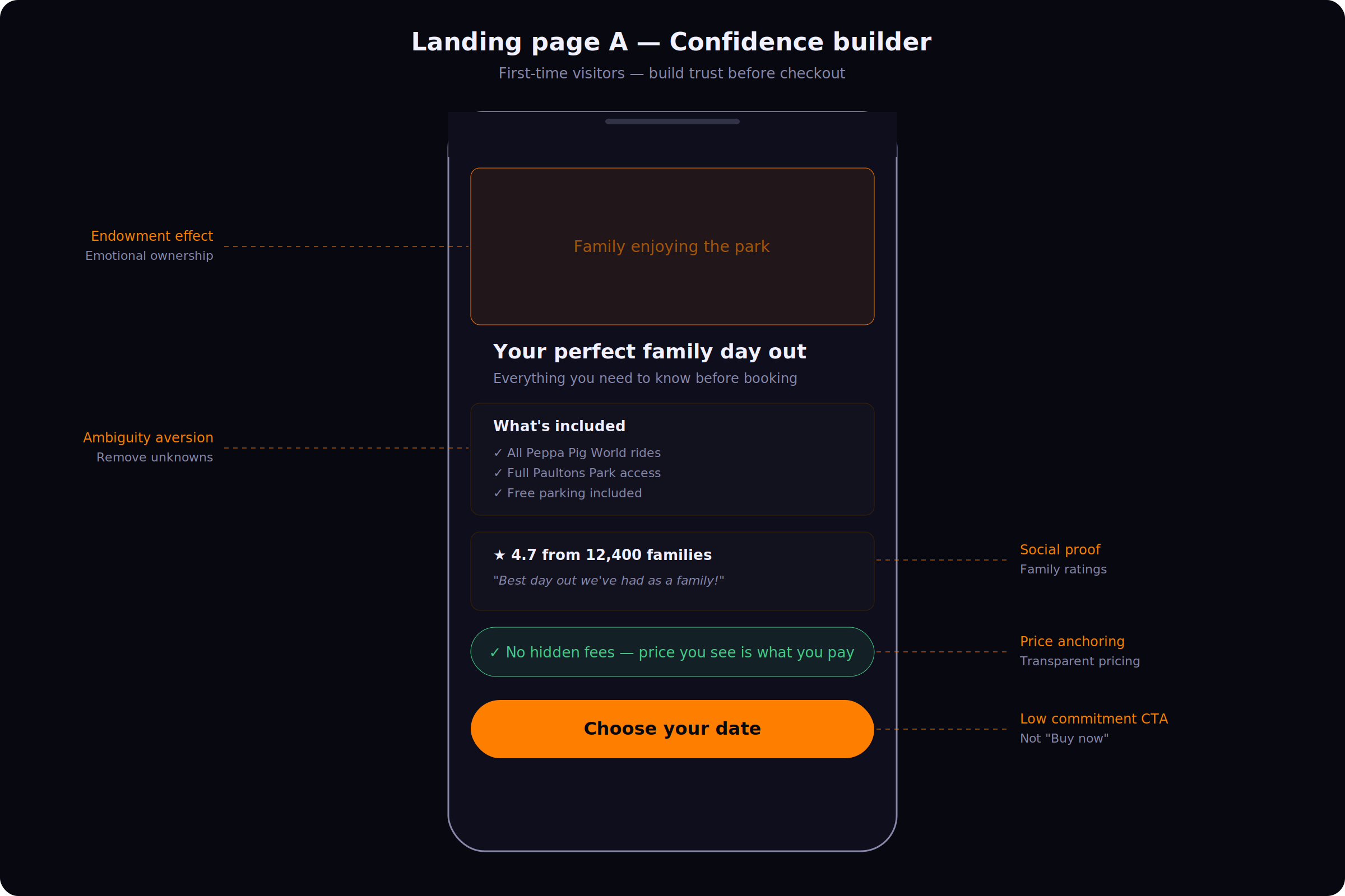
Confidence Builder — emotional connection, social proof, and transparent pricing before users reach the basket
Landing Page B — Returning Visitors: "Fast Track"
Goal: Remove friction. Get to checkout fast. Respect their time.
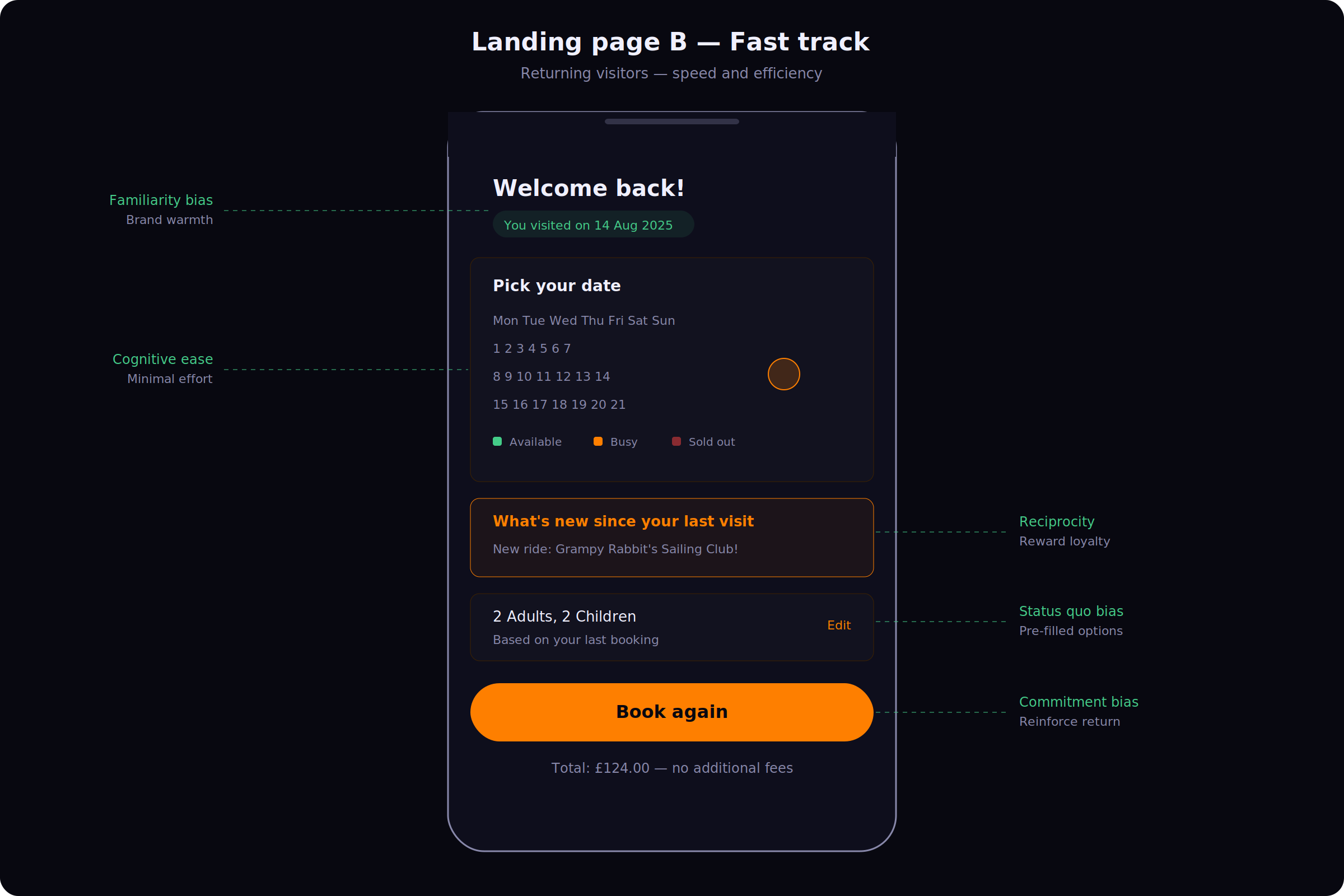
Fast Track — personalised recognition, streamlined date picker, and pre-filled ticket data for returning visitors
Every decision mapped to a behavioural principle
The design isn't intuitive — it's intentional. Each element in both landing pages was chosen to address a specific cognitive barrier or motivational driver.
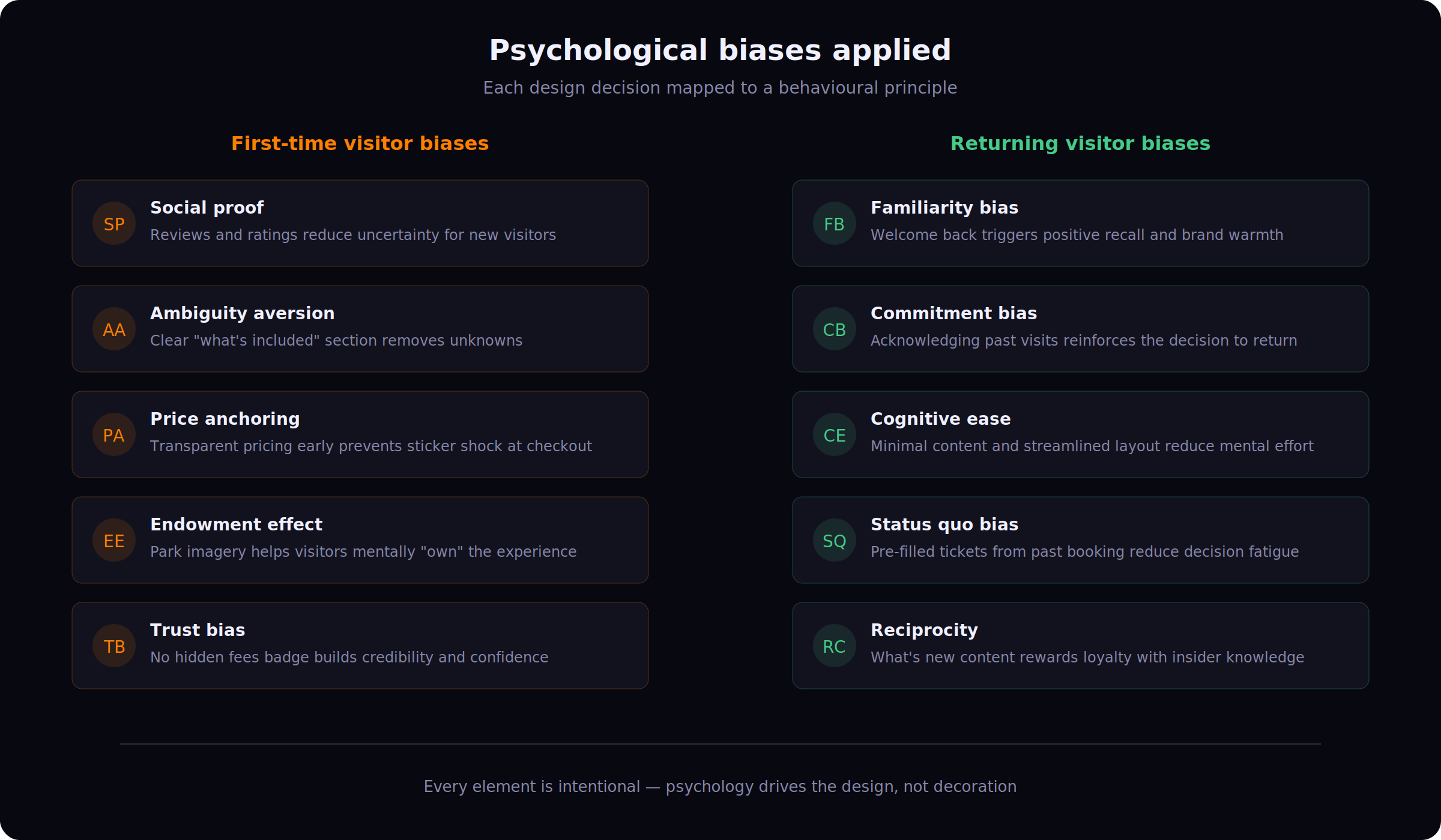
Behavioural principles mapped to each design decision across both landing pages
First-time visitor biases
Returning visitor biases
Fixing the shared journey too
Beyond the two landing pages, we also redesigned shared elements of the checkout that were causing friction for all users.
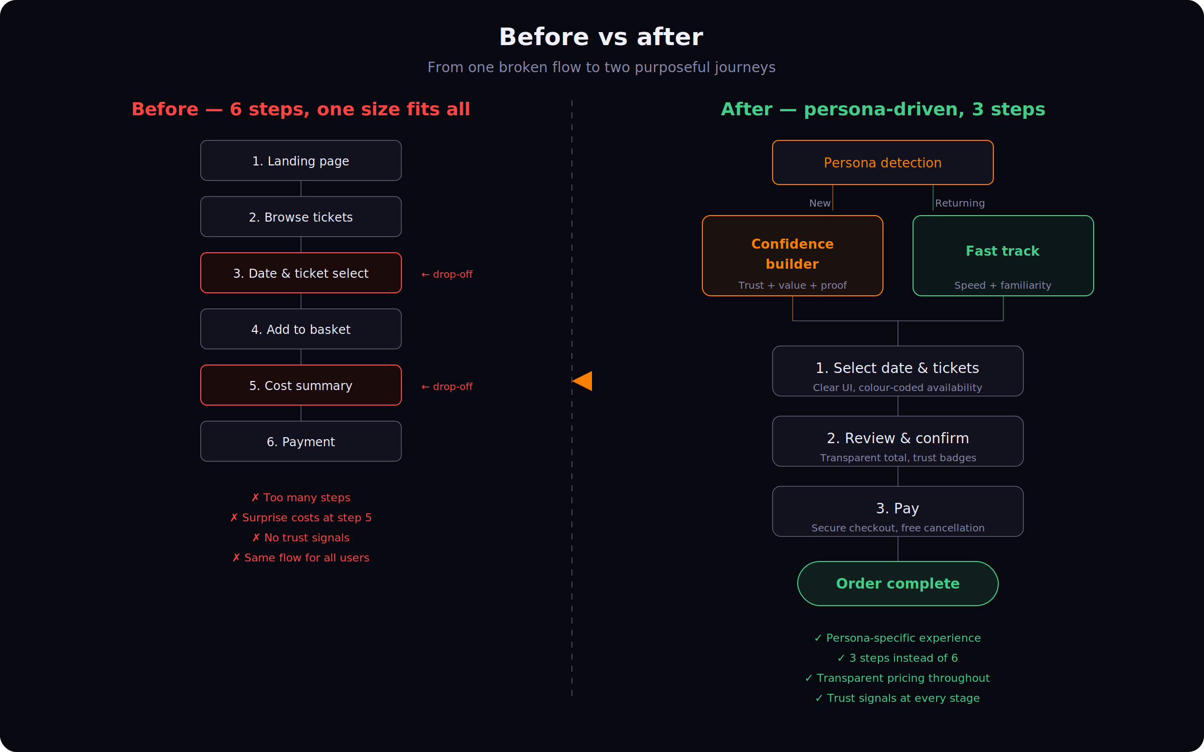
Before and after — 6-step funnel collapsed to 3, with transparent pricing and trust signals throughout
Designed to convert. Ready to measure.
The redesigned flow was built and handed off to the development team. The project did not reach the measurement phase during the engagement.
Based on the research, the strategic approach was designed to reduce abandonment for first-time visitors by addressing uncertainty, speed up checkout for returning visitors by removing unnecessary steps, eliminate surprise costs with transparent pricing, and improve mobile usability through a simplified, mobile-first UI.
"Not every user abandons for the same reason. The most effective conversion strategy isn't a single optimised flow — it's understanding that different audiences need fundamentally different experiences."